Full notebook available on GitHub
Even if they may sometimes be less accurate, natively interpretable estimators such as linear models are often preferred when interpretability is at stake. In this notebook, we build a random forest model that delivers a better test RMSE than an unregularized linear regression, then we use Tree SHAP to estimate the Shapley values and interpret the predictions.
I) Dataset
The health insurance dataset can be found on Kaggle. It describes the individual medical costs billed by a U.S. health insurance over an unknown period of time.
|
|
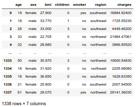
The names of the independent variables are self-explanatory, except for the column BMI. BMI stands for Body Mass Index, defined as $BMI = \frac{weight}{height²}$ in kg/m². It is considered normal between 18.5 and 25 kg/m². Obesity starts at 30 kg/m².
II) Brief analysis
|
|
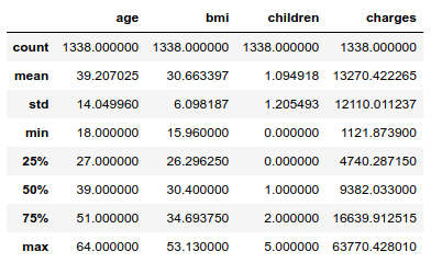
The standard deviation of the charges is about 12 000 dollars, which looks high given the mean equal to 13 270 dollars. Getting a model to produce accurate predictions may be a challenge.
The U.S. life expectancy stands at 79 years, so the elderly are not well represented in the dataset: the eldest individual is 64. About half the population is obese by WHO standards.
|
|
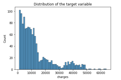
The distribution of the dependent variable appears to be log-normal, as expected: this phenomenon is very common for strictly positive variables, especially amounts of money.
|
|
The whole dataset does not contain any missing value.
Let us give a quick look at the relationships between the independent variables, namely correlation and multicollinearity. This question is important for the computation of exact Shapley values because it is a permutation-based interpretation method: since it relies on random sampling, it will include unrealistic data instances if some features are correlated. For example, in order to estimate the importance of the feature is a smoker, it might randomly generate an observation that is 8 years old. Obviously/hopefully, this observation is very unrealistic. As a consequence of correlation/multicollinearity, the obtained Shapley values will be unreliable.
As a matter of fact, the Tree SHAP algorithm can solve this problem by modeling conditional expected predictions. But this comes at the cost of breaking [1] the symmetry property of the exact Shapley values: “The contributions of two feature values should be the same if they contribute equally to all possible coalitions” [2]. So, the sum of Shapley values associated to correlated features will be consistent, but not their distribution. In other words, if features A and B are highly correlated, Tree SHAP may give different importances to A or B depending on the random seed of at the time the underlying model was built. Besides, even if a given feature C does not have any influence on the dependent variable, it could be attributed a non-zero Shapley value.
The other reason why we are studying relationships between input variables is the absence of multicollinearity assumed by linear regression, which we will perform later on. Other assumptions, namely homoscedasticity and normality, are adressed once the model is built. Anyway, the residuals are very likely to be heteroscedastic: risky profiles (old, smoker, high BMI, etc…) are probably subject to a high variance of charges, while “safe” profiles might stay in the low-charges zone.
i) Continuous variables
Below is the correlation matrix of the continous columns, including the target:
|
|
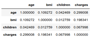
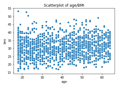
The Pearson’s correlation coefficients between the input variables are very low. With that said, it is worth noting that the correlation between age and BMI is 10 times higher than the age/children and bmi/children correlations. The older the bigger, apparently… However, this very weak link between age and BMI does not appear to hide other potential nonlinear relationships:
|
|
In order to assess multicollinearity, the Variance Inflator Factor if often used. The relevance of this metric is debated for categorical variables. Let us compute VIFs for independent continuous variables only:
|
|
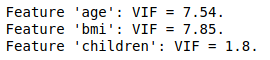
The VIFs of features age and BMI are moderately high, since common rules of thumb are to judge the amount of multicollinearity problematic if a VIF value is greater than 5 or 10 (see An Introduction to Statistical Learning for example). As a consequence, we shall fit a linear model with the two features together / only age / only BMI. Then, computing the RMSE on the test sample for each model and performing an analysis of variance will allow us to better grasp the multicollinearity problem.
As for the Random Forest model, multicollinearity is not a problem regarding performance. This is one of the reason this algorithm is so popular and efficient. However, it has consequences on the interpretation part. Due to the random feature selection that occurs while building a RF, the model may rely more on a correlated variable rather than an other for no other reason than chance. In the case of insurance costs, one RF may attribute more importance to age than to BMI, and the other way around for another RF. As SHAP explains the model and not the data, this phenomenon has a substantial impact on the SHAP values attributed to the said features. This point also makes the connection with the correlation/multicollinearity problem mentioned above that is inherent to the computation/estimation of the Shapley values, regardless of the underlying model.
This matter is something to keep in mind for the interpretation process when retaining potentially correlated features in the model.
ii) Continuous/categorical pairs of variables
We are going to visually inspect the dependence between continuous and categorical variables using boxplots, even though metrics such as the point-biserial correlation coefficient exist (this one only works with binary variables though). We could also dive into linear discriminant analysis or other multinomial classification models, but that would make this preliminary study too lengthy.
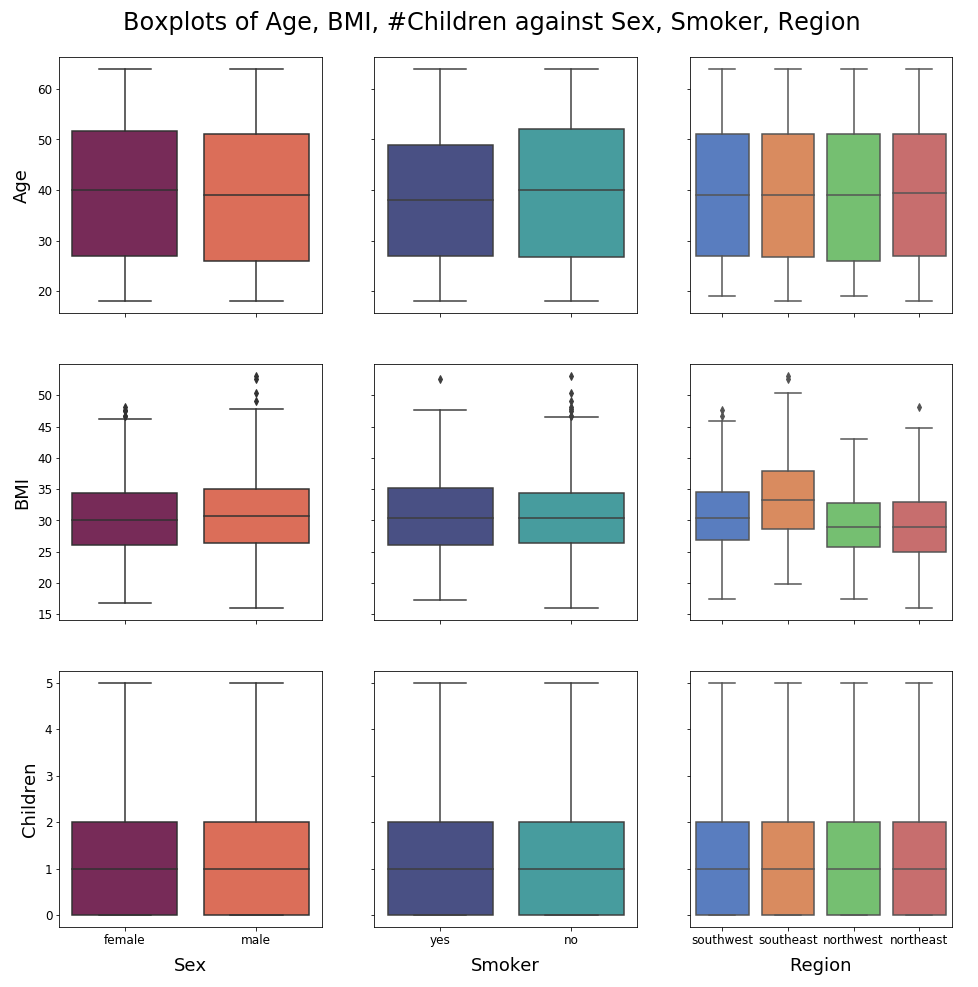
No unequivocal relationships emerge from these plots. Nonetheless, it is notable that nonsmokers are generally older than smokers. Also, people from the American Southeast tend to have a higher BMI than people from the other parts of the country: what is happening in Florida ?! The boxplots for the ordinal feature # children are moderately informative, but we are not going to push the analysis further as the main topic of this notebook is interpretability/SHAP.
iii) Categorical variables
|
|
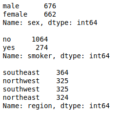
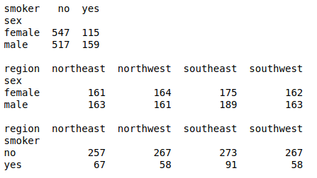
The dataset is very well balanced regarding sex and region. This is less true regarding the smoker feature with around one smoker in four individuals, but the situation is far from being critical and does not require any specific data processing in my experience.
Now let us compute Cramér’s V for each pair of distinct categorical variables. Since this metric is based on the $\chi²$ test of independence, each cell of the contingency tables should have a frequency greater than 5, otherwise the computed values will not be reliable.
|
|
All combinations of levels have frequencies well above 5 so the Cramér’s Vs below are highly reliable.
|
|
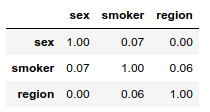
To each pair of distinct categorical features corresponds a very low Cramér’s V. The categorical variables appear to be independent.
iv) Conclusion
On the whole, the features give every appearance of being uncorrelated, with reservations for the couple (age, BMI). The Variance Inflation Factors of these two variables are indeed a bit high. This fact encourages us to push further investigations with linear regression, and to be more careful when evaluating the Shapley values of these features if we were to retain them in the final model.
III) One-hot encoding
|
|
IV) Train/Test samples
|
|
V) Linear regression / Multicollinearity
We are going to train 6 models and we will keep the one that minimizes the test sample’s RMSE:
- Since the target is an amount of money that seems to be log-normal, log-transforming the charges could help increase accuracy (2 models)
- Based on the feature analysis, we doubt wether we should include age, BMI or both variables in the model (3 models)
That makes $3 \times 2 = 6$ possibilities.
i) Linear models
After fitting the 6 linear models, the RMSEs are computed on the test sample in a dictionnary, rmse:
|
|
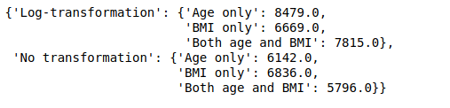
The models built with the log-transformed target perform worse than the others on the test sample. The lowest RSME obtained by log-transforming the charges—BMI only—is almost 1 000 dollars higher than the lowest RMSE with no transformation (Both age and BMI). This represents a significant amount given the range of the charges, and the range of the different RMSEs computed here. Therefore, it is clear that log-transforming the target variable did not improve the results even if the charges seem to be log-normally distributed. We will not perform a Kolmogorov-Smirnov test to verify this assertion here.
ii) Multicollinearity
We have seen that the features age and BMI both have moderately high variance inflation factors, which suggests that maybe one of them could be excluded to improve the model and make interpretations more reliable. However, including both variables has yielded the lowest out-of-sample RMSE, while excluding the BMI increases it by approximately 350 dollars. Is this significant ?
Let us switch to R to perform an analysis of variance of the nested models with/without the BMI variable. The F-statistic will help us to determine if the full model yields a significant drop in sum of square errors or not. In this case, we are testing the nullity of only one feature so the F-statistic is equivalent to the t-statistic of BMI in the full model ($F = t²$). The associated p-values are equal.
We will also evaluate the homoscedasticity and normality of the residuals that are assumed by analysis of variance.
A. ANOVA
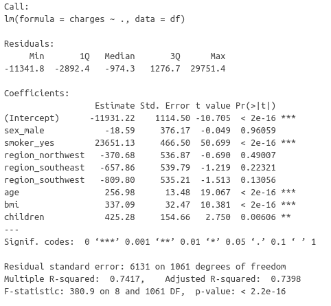
The t-statistic of the BMI is very high, so much that the associated p-value is negligible. But what about the assumptions made by this test of nullity ?
B. Homoscedasticity
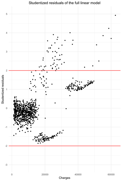
The residuals show heteroscedasticity. Nonetheless, the situation is not disastrous. The red lines represent the 95% centered confidence interval of the Student distribution and it turns ou that 5.14 % of the observations are outside these bounds (see R script). However, all these observations have a studentized residual greater than 2 and not one is less than -2, i.e there is no symmetry.
The residuals are homoscedastic until charges approximately equal to 15 000 dollars. After that, clearly the heteroscedasticity “begins”. It is notable that between 15 000 dollars and 30 000 dollars, the model either underestimates or overestimates the charges. Above 35 000 dollars, the model underestimate the charges. High charges are underestimated by the linear model.
On the whole, the residuals of this linear regression are faintly heteroscedastic. Given the size of the sample (around 800 observations), this phenomenon should not have major consequences on inference. Indeed, an important sample size stabilizes the standard errors estimates used to compute the statistics for significance testing and confidence intervals/p-value.
C. Normality
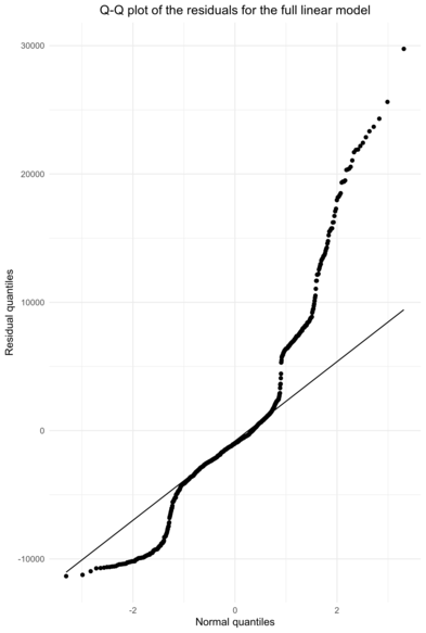
The Q-Q plot shows that the assumption of normality for the residuals does not hold well. A high proportion of observations shows low residuals. Then, after fitting the normal quantiles for a significant part of the observations, the residuals show extreme values, greater than if they were normally distributed.
Once again, we cannot conclude the the assumption of normality holds, but the situation is not catastrophic either. Besides, significance testing in linear models is robust to non-normality, see [3] for example.
iii) Conclusion
Considering the moderately high variance inflation factors for the features age and BMI, we suspected multicollinearity in the input features. Performing linear regression with different subsets of features suggested that the BMI might not bring substantial information to model insurance charges. Then, an analysis of variance of the linear model with and without the BMI feature assessed a very high significance for the BMI variable. This conclusion could be challenged by the moderate heteroscedasticity and non-normality of the residuals. However, the size sample mitigates the impact of heteroscedasticity and ANOVA is robust to non-normality. Besides, given the negligible p-value associated with the extremely high value for the t-statistic, we conclude that the BMI should be included in the feature set to model the insurance charges and we rule out the hypothetical problematic multicollinearity of the input variables.
Given this outcome, the estimated Shapley values of both age and BMI will be reliable.
VI) Random Forest
We are going to perform a grid search using the 8 cores of the P4000 we are working with.
|
|

The best estimator consists in 500 trees. They are quite deep since the minimum number of samples required to split an internal node (min_samples_split) is only 10. The best number of features picked to look for the best split (max_features) is 4. This is close to the common value sqrt(num_features).
|
|
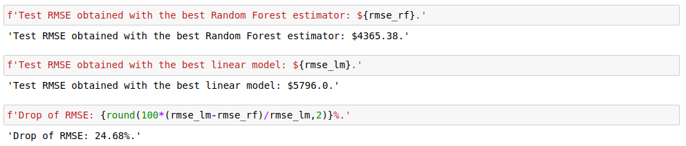
A straightforward hyperparameter tuning of the Random Forest algorithm with grid search improved the RMSE by 25%. So, as far as accuracy is concerned, switching to tree ensembles is justified. Similar results could possibly be achieved by regularizing the linear model, engineering the features (other transformations of the target variable for example), identifying non-linear relationships with predictors, etc… But this is highly time-consuming in comparison with a mere grid search for the parameters of a tree ensemble.
Despite their efficiency and accuracy, algorithms like Random Forest are often dismissed because they are black box models. This is especially the case in regulated fields such as finance or healthcare. The Shapley values and their estimation with Tree SHAP is a major breakthrough in the quest for getting the best of both worlds.
VII) Interpretation with SHAP
Now, we compute the estimated Shapley values for the test sample. We build our regressor’s shap.TreeExplainer with the feature_perturbation parameter set to the default value, 'interventional'. This means that it relies on marginal distributions of the input features, not conditional distributions: see this SHAP issue and [4] for more in-depth explanations. Since we have achieved substantial work to rule out multicollinearity, the estimation of the Shapley values is dependable. One would describe this explainer as being “true to the model” while it would be “true to the data” when feature_perturbation='tree_path_dependent'.
|
|
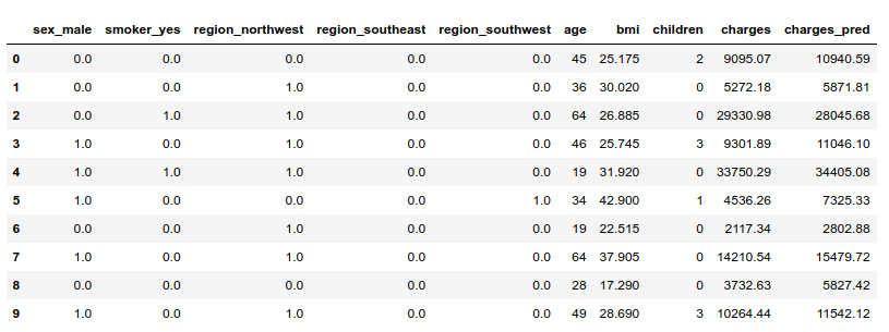
Let us display a few observations with both their observed and predicted charges:
|
|
i) Explaining predictions for individual observations
Let’s visualize the explainer’s estimation of Shapley values for given observations. The baseline for Shapley values is the average of all predictions from the training set.

Then, each feature’s Shapley value is added or substracted from this baseline to explain a given prediction. For example, billed charges were important for individual #2 (cf. table above). These charges were very well anticipated by the model. Let us compute the Shapley values for this observation.
|
|
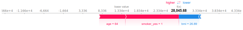
This plot shows how each feature moves the prediction away from the baseline. The smoking habit of this individual is what drives the prediction above the baseline the most, closely followed by age. This person is in fact the eldest in the dataset. Her reasonable BMI (generally considered to be balanced for values between 18 and 25) “pulls” the prediction towards the left, that is decreases the prediction for billed health charges.
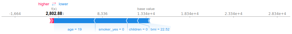
Observation #6 has very low predicted (and observed) charges. His young age and the fact that he does not smoke explain the most part of this prediction. The influence of the BMI is less significant here.
Of course, the model failed to predict the billed charges in a number of cases:
|
|
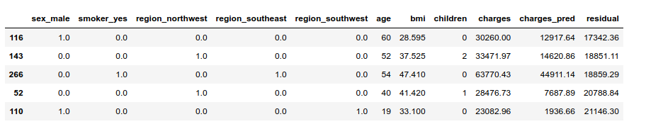
Let us see what happened with the highest residual. The model predicted less than 2 000 dollars, but the individual was charged more than 20 000 dollars:
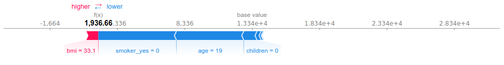
We can see why the model predicted low charges for individual #110. Basing our judgment on the population’s characteristics (not WHO’s standards…), he has a moderately high BMI: the mean of the whole population is at 30, and the third quartile at 34). Apart from that, the estimator had every reason to output a low prediction.
ii) Explaining the whole model
I find SHAP to be the most impressive with individual explanations because this is something we had never seen before—as far as I know—with black box models. These individual explanations can also be aggregated/displayed in different ways to enlighten the mechanics of the whole model.
A. Summary
A summary plot of all the computed Shapley values gives a sense of the global behavior of the estimator:
|
|
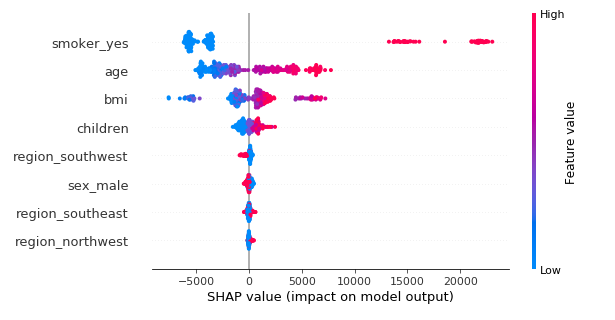
On the y-axis, the features are sorted by decreasing order of importance. The importance of a feature is defined as the mean of the absolute value of all the computed SHAP values. This plot is much more informative than the usual out-of-bag feature importance plot for tree ensembles, because we can see how the variables affect the prediction. The color represents the feature value. For categorical variables, red means “yes” and blue means “no” according to the way they were one-hot encoded. All the points are the studied individuals, vertically jittered when to close to each other.
For example, we can see that if not smoking significantly reduces the predicted charges, smoking dramatically increases the prediction: the rise is actually greater than the drop. This information is much harder—if not impossible—to grasp with the usual aggregated feature importance metric.
B. Feature importance
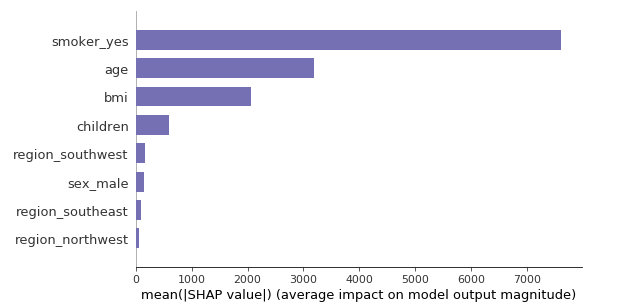
Let us compare the importance of the variables computed with SHAP values versus Random Forest.
SHAP
|
|
Random Forest
|
|
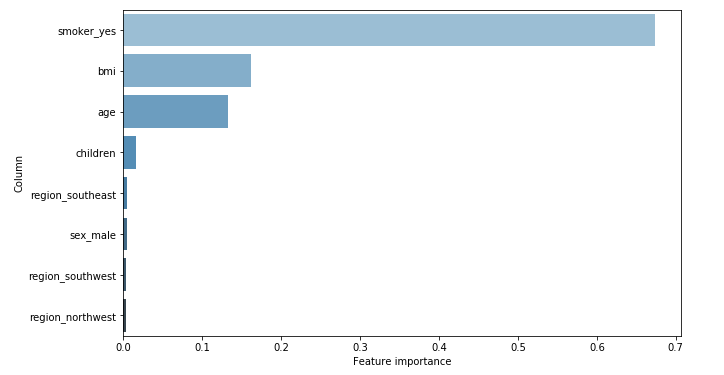
Since the SHAP feature importance is the mean of the Shapley values (in absolute value), it is expressed in terms of dollars. The average effect of smoking is plus or minus 7 000 dollars, starting from the baseline prediction (13 400 dollars). Whereas with Random Forest, we only know it is around 67%. We can just compare this value with the other features’ importance.
Besides, the actual importances of each feature that are given by the two methods are similar but not identical. The BMI comes before age according to Random Forest, while SHAP tells the contrary. In addition, the associated values are closer with Random Forest. It could be that the small correlation (0.11) between these two features makes it hard to evaluate their real importance. However, telling who is right between SHAP or RF is beyond my current knowledge.
C. Partial dependence plots
Single feature dependence
The SHAP library provides tools to have a grasp of the partial dependence between the predictions and one or two features. The plot below shows the same information as the summary_plot() above for the variable sex, but much more readable and precise: features values on the x-axis/estimated Shapley values on the y-axis.
|
|
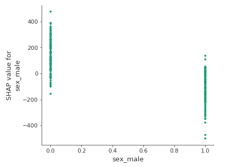
The estimated Shapley values are higher for women than for men. It could be due to the motherhood for example. That being said, let us keep in mind that SHAP explains the model and that it does not give causal explanations.
Feature interaction
SHAP also computes the Shapley Taylor interaction index [5] for each pair of features. These are Shapley values that account for the pure interaction effect after subtracting the individual feature effects. When selecting only one feature, SHAP can automatically pick the other variable with the strongest interaction, meaning the variable that has the most correlated Shapley values with the other variable’s Shapley values (see this SHAP issue). Other interaction variables can be picked through the interaction_index parameter.
|
|
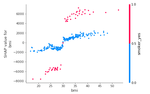
This plot is very surprising: the model attributes a positive effect to the interaction of smoking and having a reasonable BMI (under 30). In other words, the model is saying that smoking tends to reduce health charges when one has a low BMI. Once again, this is not a causal model at all. This phenomenon could be due to a confounding variable: for example, fit smokers could overlook their health issues more than fit nonsmokers, leading to less billed charges. Or low-BMI smokers of this dataset could exercise more than low-BMI nonsmokers.
As expected, the interaction is the other way round for people with high BMIs.
D. Stacked SHAP values
Finally, SHAP works a clustering out of the explained observations. The default method is hierarchical agglomerative clustering. It is based on the estimated Shapley values of the features instead of their true values. This is very handy since Shapley values all have the same scale whatever the feature.
The plot below order the observations by their similarity pertaining to the hierarchical clustering. On the y-axis is the prediction, displayed as the sum of the Shapley value of each feature.
|
|
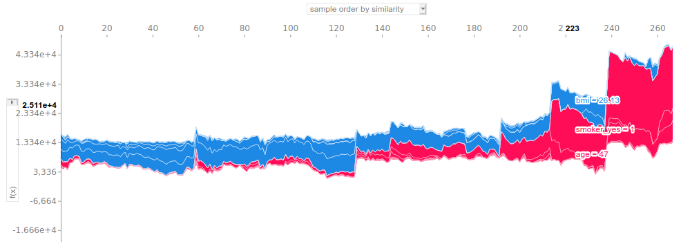
This plot is useful when used in a interactive way. Hovering on the figure displays the true values of the features with the highest SHAP values. It helps to quickly have an understanding of the clustering. For example, we can pick up four clusters here:
- Cluster 1: observations 0 to 130. Low billed charges overall (well below 10k). These individuals are all nonsmokers, quite young and occasionnaly overweight.
- Cluster 2: observations 130 to 210. The predictions are generally between 10k and 15k. All the subjects are still nonsmokers, but older than the first cluster’s observations: a lot of them are over 50 (and over 60 after observation 190).
- Cluster 3: observations 210 to 240. Welcome to the realm of smokers! Predicted charges are well above 20k on the whole. Smoking accounts for the most part of the prediction and having a low BMI significantly lowers the output.
- Cluster 4: from observation 240 on. Surprisingly, this cluster does not relate to old people only given the distribution of the studied data. Actually, all the observations are overweight smokers.
This feature of SHAP is very useful to identify approximate populations and tendencies regarding the model’s output.
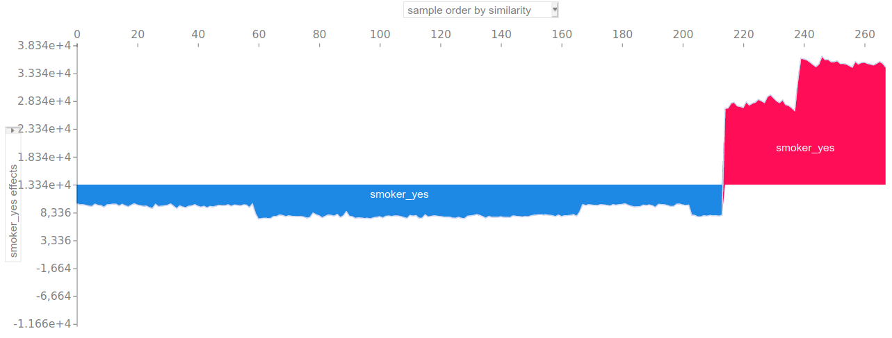
It can also be used as an alternative to partial dependence plots. For example, the following plot displays the Shapley value of the smokes: no / smokes: yes feature for each observation:
VIII) Conclusion
The main conclusion of this article could be: don’t smoke, be slim and be young (in order of importance).
Apart from that, we have seen a concrete use case of the SHAP library. This experiment aimed at predicting the health charges billed to 1 338 American citizens depending on their smoking habit, age, BMI, sex, etc… Before any modeling, a brief analysis of the variables was made: correlation/multicollinearity (also useful for the explanation part), feature engineering, assumptions of the linear model, etc… Despite this preliminary work, the linear model failed to give good results. On the contrary, a simple grid-search-tuned Random Forest achieved 25 % less RMSE than linear regression on the test sample. It could be argued that despite its superior prediction power, this model is a black box, yet being able to justify sensitive predictions such as health charges is a necessity. We showed that the SHAP library can provide consistent and efficient explanations of tree-based models’ outputs (and any machine learning model actually).
On a general note, interpretable machine learning is a already a tremendous concern for real-life AI applications. This is particularly true in high stakes and/or regulated fields such as health or finance. Organizations have to be able to explain their decisions when identifying fraudsters, diagnosing serious diseases or letting drones fly around. In the mean time, we have seen the rise of black box models like tree ensembles or neural networks in the recent years. They frequently provide better results than “transparent” models such as linear or logistic regression, sometimes with less work to do beforehand. As a consequence, there is a growing tension between accuracy in a broad sense, and interpretability.
In this regard, SHAP is a major breakthrough in the field of interpretable ML because it allows practitioners to get the best of both worlds. A few elements distinguish it from previous methods:
- It provides both global and individual explanations
- It connects each feature to the prediction in a very tangible way
- Shapley values have consistent mathematical properties (additivity, symmetry…)
- Its implementation is very efficient with tree-based models
I am convinced that SHAP and probably other interpretable ML tools will have a substantial impact on operational AI in the coming years.
Full notebook available on GitHub
References
[1] Sundararajan, Mukund, and Amir Najmi. The many Shapley values for model explanation. arXiv preprint arXiv:1908.08474 (Google, 2019).
[2] Molnar, Christoph. Interpretable machine learning. A Guide for Making Black Box Models Explainable, 2019. https://christophm.github.io/interpretable-ml-book/.
[3] Ulrich Knief, Wolfgang Forstmeier. Violating the normality assumption may be the lesser of two evils (2020)
[4] Lundberg et al, Explainable AI for Trees: From Local Explanations to Global Understanding. arXiv:1905.04610v1 (University of Washington, 2019)
[5] Kedar Dhamdhere, Mukund Sundararajan, Ashish Agarwal. The Shapley Taylor Interaction Index. arXiv:1902.05622v2 (Google, 2020)